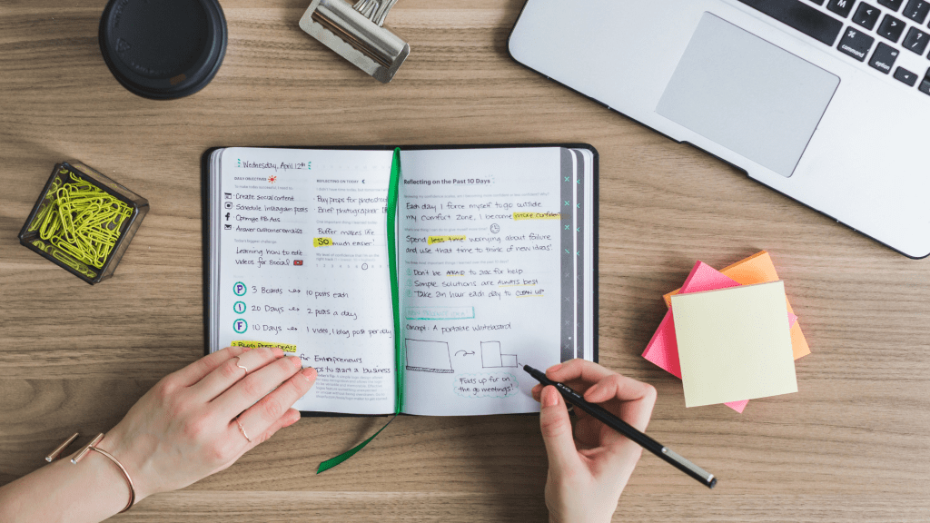
Confession: I have absolutely fallen down the YouTube rabbit hole of “study with me” videos before. You know the ones—lofi beats, glass of iced matcha, handwriting that looks like it should be sold on Etsy. They call it “note-taking,” but let’s be honest, it’s calligraphy practice.
Meanwhile, I’m sitting in AP Chem trying to copy down equations before the teacher erases them, and my handwriting looks like a doctor’s prescription gone wrong. So, what actually works for real students: the structured Cornell Notes system or the “make it cute and hope it sticks” aesthetic approach?
Let’s break it down.
The Case for Cornell Notes
If you’ve never used them, Cornell Notes look like this:
- Big right-hand column for actual notes
- Skinny left-hand column for keywords/questions
- Bottom summary box for—you guessed it—summaries
It’s not glamorous, but it works. The genius of Cornell Notes is that they force you to review. You can cover the big notes and quiz yourself with the skinny column. You can flip back and actually find things because the page is structured.
Basically, Cornell Notes are the Honda Civic of note-taking: not flashy, but they’ll get you from Point A (lecture) to Point B (exam) without breaking down. My APUSH binder is living proof—when finals hit, I could actually find “causes of the Mexican-American War” instead of flipping through 200 pages of chaos.
The Case for Aesthetic Notes
Now, aesthetic notes are the complete opposite. Think pastel highlighters, fancy headers, and diagrams that look like they belong in a textbook. They’re satisfying to look at, and they make you want to study, which is honestly half the battle.
The first time I made aesthetic notes, it was for AP Lang. I color-coded rhetorical devices, wrote out examples in blue ink, and added doodles for ethos, logos, and pathos (don’t ask me why Aristotle looked like a blob, but it worked). Reviewing them later? Genuinely fun.
But here’s the catch: they take time. Like, way more time. If you’re rewriting every heading in bubble letters, you’re probably not actually processing the material—you’re just making art. And if you’re in a fast-paced class (looking at you, AP Chem), there is zero chance you’re pulling out five different highlighters in the middle of lecture without falling behind.
My Honest Approach
Here’s how I survived APUSH, DECA prep, and all the other academic chaos: I combine both.
- In Class: Cornell-style “dump notes.” Messy, arrows everywhere, abbreviations only I understand. No one is meant to see them. If you ever looked over my shoulder, you’d think I was writing in code.
- After Class: I’ll rewrite them, and this is where the aesthetic comes in. Clean headers, colors, maybe a quick doodle if it helps me remember. The point isn’t to be pretty for Instagram—it’s to trick myself into sitting down and reviewing.
It’s like functional chaos → organized chaos.
When Each System Saved Me
- Cornell Notes Victory: Right before my APUSH unit test, I only had 20 minutes at lunch to study. Instead of spiraling, I skimmed the key questions in the Cornell margins and quizzed myself rapid-fire. I pulled a 95. Efficient and effective.
- Aesthetic Notes Victory: During DECA prep, I rewrote key vocab in aesthetic notes with boxes and highlights. It looked ridiculous, but when I was in the role-play, I could literally picture the exact page in my head and remember the definition. That never would’ve happened with my chicken-scratch in-class notes.
What Actually Works (Spoiler: Both)
The real answer is that Cornell Notes and aesthetic notes serve different purposes. Cornell Notes win in terms of efficiency, structure, and retrieval practice. Aesthetic notes win in motivation and making studying less miserable.
If I had to choose, I’d go Cornell for lectures and aesthetic for test prep. That way, you’re not falling behind trying to make your in-class notes pretty, but you still get that satisfying “wow, my notes look good” moment later when you’re reviewing.
Final Thoughts
At the end of the day, your notes don’t need to be Pinterest-worthy. They need to be usable. If that means sticking with Cornell Notes and never touching a pastel highlighter, do it. If that means rewriting your notes into a rainbow-coded masterpiece, more power to you. Just remember: the prettiest notes in the world are useless if you never actually study them.
So yeah—Cornell Notes = practical. Aesthetic Notes = motivational. My system = messy first draft, aesthetic(ish) second draft. That’s what actually works.


Leave a comment